Skin Layout
General Information#
All textures must be power of two in size, rectangular textures are supported, for example, 16×16, 128×32, 8×64, etc. All files are in the RGBA format.
Icons#
Layout#
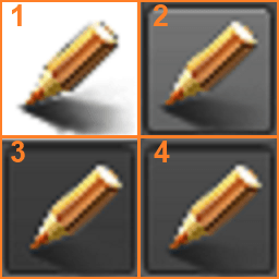
There are four states of an icon:
- Not pressed, not in focus.
- Not pressed, in focus.
- Pressed, not in focus.
- Pressed, in focus.
Assembly#
Parts of the texture are copied 1:1.
Boot and Loading Screens#
Layout#
The texture is divided into two parts: the initial state (upper) and the final state (lower).
Assembly#
While a texture of a loading screen is being displayed, the initial picture (upper) is gradually replaced with the final one (lower). Pseudo-animation can be created using the alpha channel: regions of the lower half with small alpha values will be shown first, regions with larger alpha values will be shown last.
Base Skin#
gui_background.png#
gui_border.png#
Layout#

Assembly#
All four corners are copied 1:1 from corresponding corners of the texture:
- The top-left corner
- The top-right corner
- The bottom-left corner
- The bottom-right corner
Vertical and horizontal strips (2 pixels in width), which are located at the center of the corresponding half of the texture are used to fill in space between corners. The strips are stretched, and the resulting color bar is constructed using interpolation between colors of the pixels in the strips.
gui_button.png#
Layout#
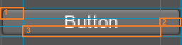
The texture contains four variants of buttons in different states, the same as defined for icons. Also, each button is divided into 3 parts, which are shown below.
Assembly#
All four corners are copied 1:1 from corresponding corners of the texture. Vertical and horizontal strips (2 pixels in width), which are located at the center of the corresponding half of the texture and marked as 2 and 3 on the picture are used to fill in space between corners. The strips are stretched, and the resulting color bar is constructed using interpolation between colors of the pixels in the strips.
gui_checkbox.png#
Layout#
The texture contains two variants of checkboxes (left column) and two variants of radio buttons (right column) for unchecked/unselected (top row) and checked/selected (bottom row) states.
Assembly#
Parts of the texture are copied 1:1.
gui_combobox.png#
Layout#
The texture contains two variants of combobox icons: closed menu (upper) and opened menu (lower).
Assembly#
Parts of the texture are copied 1:1.
gui_editor.png#
Assembly#
The left half of the texture is stretched to fill a widget. When pointing a mouse, it smoothly shifts to the right half.
gui_hpaned.png#
gui_hscroll.png#
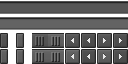
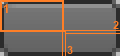
Layout#
The texture is divided into five zones, each of which uses the layout similar to the icon layout. Bottom-left corner has a specific layout, since it contains unused regions (highlighted with green hatching).
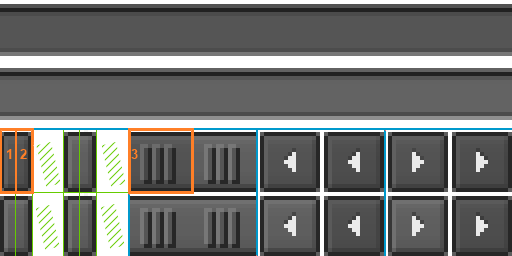
Assembly#
The scroll bar handle is combined from the left (1), central (3) and right (2) parts; the underlying bar is stretched to the given width.
gui_hslider.png#
gui_hspacer.png#
gui_mouse.png#
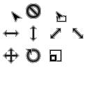
Layout#
There is a number of slots for different pointer states:
- Base pointer
- Operation is not permitted
- Drag-and-drop mode
- Reserved slot
- Changing size horizontally
- Changing size vertically
- Changing size diagonally (1)
- Changing size diagonally (2)
- Movement
- Rotation
- Scaling
Other slots are reserved.
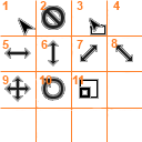
Assembly#
Parts of the texture are copied 1:1.
gui_selection.png#
Assembly#
The left half of the texture is used to highlight the text and the right one is used to highlight the selected tree element.
gui_spinbox.png#
Layout#
The texture is divided into two parts: the left part is for an upper arrow, the right part is for a lower arrow. The layout of each part is the same as the icon layout and contains four states:
- Not pressed, not in focus.
- Not pressed, in focus.
- Pressed, not in focus.
- Pressed, in focus.
Assembly#
Parts of the texture are copied 1:1.
gui_tabbox.png#
Layout#
Layout is the same as for buttons.
Assembly#
The assembly is the same as for buttons.
gui_tooltip.png#
Layout#
Layout is the same as for borders.
Assembly#
The assembly is the same as for borders.
gui_treebox.png#
Layout#
The texture is divided into three parts:
- The upper left part is for folded non-leaf nodes.
- The lower left part is for folded non-leaf nodes.
- The right part is for "branches" connecting nodes.
Assembly#
Parts of the texture are copied 1:1.
gui_vpaned.png#
gui_vscroll.png#
Layout#
Layout is similar to the layout of the horizontal scroll bar.
Assembly#
Assembly is similar to the assembly of the horizontal scroll bar.
gui_vslider.png#
Layout#
Layout is similar to the layout of the horizontal slider.
Assembly#
Assembly is similar to the assembly of the horizontal slider.
gui_vspacer.png#
gui_window.png#
Layout#
On the image below, the left half is for windows with caption and the right half is for windows without caption.
Assembly#
All four corners are copied 1:1 from the corresponding corners of the texture. Vertical and horizontal strips (two pixels in width), which are located at the center of the corresponding half of the texture are used to fill in space between corners. The strips are stretched, and the resulting color bar is constructed using interpolation between colors of the pixels in the strips.
Dialogs#
Base Dialog#
Two files are used to create a base dialog. These files correspond to two buttons of the dialog. Images are copied 1:1.
-
 - dialog_ok.png
-
 - dialog_cancel.png
File Dialog#
This dialog requires four images that use the icon layout.
- Go to the upper directory:
 dialog_file_path.png
 - Add a tab
 dialog_file_add.png
 - Remove the tab
 dialog_file_remove.png
 - Mini-icons for different file objects; split vertically into squares:
 dialog_file_list.png
Image Dialog#
This dialog requires four images that use the icon layout.
- Red channel toggle:
 dialog_image_r.png
 - Green channel toggle:
 dialog_image_g.png
 - Blue channel toggle:
 dialog_image_b.png
 - Alpha channel toggle:
 dialog_image_a.png
The information on this page is valid for UNIGINE 2.20 SDK.