Unigine::WidgetButton Class
| Header: | #include <UnigineWidgets.h> |
| Inherits from: | Widget |
Interface for widget button handling.
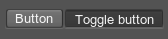
The object of this class looks as follows:
Here is an example of two buttons. Button1 has a background and image, Button2 is without them:

Notice
The button is automatically stretched or shrinked to match the size of the current texture/image. When you resize the button the size of the image does not change. In case you need to create a type of button widget with an auto-adjusted image size, or image rotation, please consider Widget Sprite instead.
See Also#
- Widget samples in C++ and C# Component Samples suite
- UnigineScript API sample <UnigineSDK>/data/uniginescript_samples/widgets/button_00
Example#
The following code illustrates how to create a button widget and set its parameters.
Source code (C++)
#include <UnigineWidgets.h>
#include <UnigineUserInterface.h>
using namespace Unigine;

/* .. */

// event handler function
int onButtonClicked()
{
	/* .. */

	return 1;
}

/* .. */

// getting a pointer to the system GUI
GuiPtr gui = Gui::getCurrent();

// creating a button widget and setting its caption
WidgetButtonPtr widget_button = WidgetButton::create(gui, "Delete");

// setting a tooltip
widget_button->setToolTip("Delete object(s)");

// rearranging button size
widget_button->arrange();

// setting button position
widget_button->setPosition(10, 10);

// setting onButtonClicked function to handle CLICKED event
widget_button->getEventClicked().connect(onButtonClicked);

// adding created button widget to the system GUI
gui->addChild(widget_button, Gui::ALIGN_OVERLAP | Gui::ALIGN_FIXED);WidgetButton Class
Members
static WidgetButtonPtr create ( const Ptr<Gui> & gui, const char * str = 0 ) #
Constructor. Creates a button with a given label and adds it to the specified GUI.Arguments
- const Ptr<Gui> & gui - GUI, to which the new button will belong.
- const char * str - Button label. This is an optional parameter.
static WidgetButtonPtr create ( const char * str = 0 ) #
Constructor. Creates a button with a given label and adds it to the Engine GUI.Arguments
- const char * str - Button label. This is an optional parameter.
void setBackground ( int background ) #
Sets a value indicating if a background texture should be rendered for the button. By default, the background texture is always rendered. The default is 1.Arguments
- int background - 1 to render the background texture, 0 not to render. The default is 1.
int getBackground ( ) const#
Returns a value indicating if a background texture is rendered for the button. The default is 1.Return value
1 if a background texture is rendered; otherwise, 0.void setImage ( const Ptr<Image> & image ) #
Sets a new image for the button.Notice
The button is automatically stretched or shrinked to match the size of the current image. When you resize the button the size of the image does not change. In case you need to create a type of button widget with an auto-adjusted image size, or image rotation, please consider Widget Sprite instead.
Arguments
Ptr<Image> getImage ( ) const#
Returns the current button image.Notice
The button is automatically stretched or shrinked to match the size of the current image. When you resize the button the size of the image does not change. In case you need to create a type of button widget with an auto-adjusted image size, or image rotation, please consider Widget Sprite instead.
Return value
Button image.void setText ( const char * text ) #
Sets a button text label.Arguments
- const char * text - Button label.
const char * getText ( ) const#
Returns the button text label.Return value
Button label.void setTextAlign ( int align ) #
Sets alignment of the button label.Arguments
- int align - One of the Gui:: Enumeration with ALIGN_* prefixes.
int getTextAlign ( ) const#
Returns alignment of the button label.Return value
Alignment of the button label: one of the Gui:: Enumeration with ALIGN_* prefixes.void setTexture ( const char * texture ) #
Sets a new texture to be used as the button image.Notice
The button is automatically stretched or shrinked to match the size of the current image. When you resize the button the size of the image does not change. In case you need to create a type of button widget with an auto-adjusted image size, or image rotation, please consider Widget Sprite instead.
Arguments
- const char * texture - Path to a texture file.
const char * getTexture ( ) const#
Returns the path to the current button image texture.Notice
The button is automatically stretched or shrinked to match the size of the current image. When you resize the button the size of the image does not change. In case you need to create a type of button widget with an auto-adjusted image size, or image rotation, please consider Widget Sprite instead.
Return value
Path to the button image texture.void setToggleable ( bool toggleable ) #
Sets a value indicating if the button is a toggle button or a simple one.Arguments
- bool toggleable - 1 to make the button a toggle button, 0 to make it a simple one. The default is 0.
bool isToggleable ( ) const#
Returns a value indicating if the button is a toggle button or a simple one. The default is 0.Return value
1 if the button is a toggle button; otherwise, 0.void setToggled ( bool toggled ) #
Sets a state of the toggle button.Arguments
- bool toggled - 1 to press the button, 0 to release it.
bool isToggled ( ) const#
Returns a value indicating if the toggle button is pressed.Return value
true if the button is pressed; otherwise, false.void setButtonColor ( const Math::vec4 & color ) #
Sets the color to be used for the button.Arguments
- const Math::vec4 & color - Four-component vector specifying the color in the RGBA format.
Math::vec4 getButtonColor ( ) const#
Returns the current color for the button.Return value
Four-component vector specifying the color in the RGBA format.void setStyleImage ( const Ptr<Image> & image ) #
Sets a button skin image.Arguments
Ptr<Image> getStyleImage ( ) const#
Returns the button skin image.Return value
Button skin image.void setStyleTexture ( const char * texture ) #
Sets a button skin texture.Arguments
- const char * texture - Path to a texture file.
const char * getStyleTexture ( ) const#
Returns the path to the button skin texture.Return value
Path to a texture file.The information on this page is valid for UNIGINE 2.20 SDK.
Last update:
2025-07-10
Help improve this article
Was this article helpful?
(or select a word/phrase and press Ctrl+Enter)