Widgets
Common Attributes and Children#
Many widgets have specific attributes, however, they all share a set of the common attributes.
Besides, all widgets can have the following children.
tooltip#
Sets a tooltip text for the widget.
Attributes:
- translate
- 0 or no
The tooltip should always have the same text. - 1 or yes
The tooltip text should be translated according to the selected language.
- 0 or no
For example:
<button>
	<tooltip>Button <br/>to press</tooltip>
	<text size="20">Press</text>
</button>
For the tooltip tag rich text formatting is always enabled.

attach#
Attaches the widget to another one.
- When applied to several checkbox widgets, converts them into a group of radio buttons.
- A hslider / vslider can be attached to a label or an editline.
- A spinbox can be attached to theeditline.
- The editline can be attached to the hslider /vslider and spinbox.
Attributes:
- format
This attribute takes a format string. - multiplier
A multiplier used to downscale values provided by the attached widget (integer). - flags
- log10
Logarithmic slider. - expand
Indicates whether the minimum or maximum value of the attached widget can be changed by writing a lower or greater value respectively into the associated editline. - min_expand
Indicates whether the minimum value of the attached widget can be lowered by writing a lower value into the associated editline. - max_expand
Indicates whether the maximum value of the attached widget can be raised by writing a greater value into the associated editline.
- log10
For example, the maximum value of the following horizontal slider can be changed by writing the greater value into the editline:
<editline name="editline"/>
<hslider min="0" max="3000">
	<attach multiplier="1000" flags="log10,max_expand">editline</attach>
</hslider>callback#
Sets a callback for the widget. Contains a name of the callback function.
Attributes:
- type
- show
The widget has become visible. Supported by all widgets. - hide
The widget is removed from GUI layout (via Gui::removeChild()). Supported by all widgets. - focus_in
The widget has got focus. Supported by all widgets. - focus_out
The widget has lost focus. Supported by all widgets. - changed
The state of the widget has changed. Supported by the following widgets:button checkbox combobox editline edittext hpaned hscroll hslider icon label listbox spinbox scrollbox treebox vscroll vslider vpaned - clicked
The widget has been clicked on and released. (See also pressed callback). Supported by the following widgets:button checkbox combobox editline edittext hpaned hscroll hslider icon listbox menubox spinbox vpaned vscroll vslider - double_clicked
The widget has been double clicked. Supported by the following widgets:button checkbox combobox editline edittext hpaned hscroll icon listbox spinbox treebox vpaned vscroll - pressed
The widget has been clicked on by any mouse button or ENTER is pressed. (See also clicked callback). Supported by the following widgets:button editline hslider icon listbox treebox spinbox vslider - released
The widget is in focus, and the mouse was released after clicking somewhere on a widget. Supported by the following widgets:button icon - key_pressed
The widget is in focus, and a key has been pressed. Supported by the following widgets:editline edittext - enter
The mouse pointer has run over the widget. Supported by all widgets. - leave
The mouse pointer has run out from the widget. Supported by all widgets. - drag_drop
The widget is dragged and dropped over another widget. Callbacks of this type should be defined both for the widget being dragged and for the target widget. Supported by all widgets.
- show
- widget
The widget attribute sets a widget reference to be passed as an argument to the callback function. Any existing widget name is allowed. - string
The string attribute sets a string argument for the callback function. Any valid string is acceptable. This attribute can also be used to pass any other data types. - variable
The variable attribute sets an argument of any variable type for the callback function. You can also pass vectors and maps. - accel_key
The accel_key attribute sets a hotkey for a given callback. For example, to run the user-defined esc_clicked() callback by pressing the ESC button, use the following:Source code (XML)The following keys can be set as the hotkey:<button> <callback type="clicked" accel_key="esc">esc_clicked</callback> </button>- ascii symbol
Any button, which has a corresponding ASCII code. - esc
ESC. - tab
TAB. - backspace
BACKSPACE. - return
ENTER. - delete
DELETE. - insert
INSERT. - home
HOME. - end
END. - pgup
PAGE UP. - pgdown
PAGE DOWN. - left
ARROW LEFT. - right
ARROW RIGHT. - up
ARROW UP. - down
ARROW DOWN. - f1–f12
Any of twelve functional buttons.
- ascii symbol
- accel_ctrl
Whether the CTRL button is pressed or not.- 0 or no
CTRL button isn't pressed. - 1 or yes
CTRL button is pressed.
- 0 or no
- accel_alt
Whether the ALT button is pressed or not.- 0 or no
ALT button isn't pressed. - 1 or yes
ALT button is pressed.
- 0 or no
- accel_shift
Whether the SHIFT button is pressed or not.- 0 or no
SHIFT button isn't pressed. - 1 or yes
SHIFT button is pressed.
- 0 or no
It is possible to set a hotkey as a combination of keys by combining the accel_key, accel_ctrl, accel_alt and accel_shift attributes. For example, to assign the CTRL+N hotkey to the ctrl_n_clicked() callback function, define the following:
<button>
	<callback type="clicked" accel_key="n" accel_ctrl="1">ctrl_n_clicked</callback>
</button>button#
Corresponds to an object of the WidgetButton class.

Attributes:
- background
Whether to render button background or not. The default is 1 (boolean). - toggleable
Whether the widget is a toggle button or an ordinary one. The default is 0 (boolean). - toggled
Whether the toggle button is pressed by default or not. The default is 0 (boolean). - texture
Path to a button image texture.
Children:
- text
Text displayed on the button. In addition to the described attribute, the following attribute are accepted:- align with values center, left, right.
NoticeIf no text is specified, the button will be automatically hidden.
<button name="Test::button" export="1">
	<text>Button</text>
</button>
<button name="Test::toggle_button" export="1" toggleable="1" toggled="1">
	<text>Toggle button</text>
</button>
To add a button without background, set the background attribute to 0:
<button name="Test::button1" export="1" texture="button_texture.png">
	<text>Button1</text>
</button>
<button name="Test::button2" export="1" background="0">
	<text>Button2</text>
</button>
The second button is the same as the first, but it has no background and image:

canvas#
Corresponds to an object of the WidgetCanvas class.
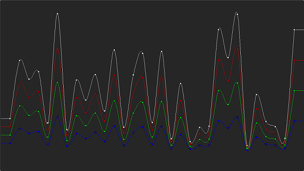
After a canvas widget was created, it can be used to draw polygons (either textured or not), lines and text via UnigineScript. The canvas can be used to create different trackers, charts, tables, etc.
Attributes:
- texture
Background texture to be drawn across the canvas
<canvas name="Test::canvas" export="1" texture="canvas/canvas.png"/>To create a simple canvas, define the canvas tag in your UI file as follows:
<window name="Test::window" export="1" width="350" height="270" sizeable="1" enabled="1">
	<text>Window Title</text>
	<label><text size="15">This is a simple canvas example:</text></label>
	<canvas name="Test::canvas" export="1" align="center" width="250" height="180"/>
</window>
Then create the corresponding objects for each widget and describe the required geometry in the script:
class Test {

	WidgetWindow window;
	WidgetCanvas canvas;

	Test() {
		ui = new UserInterface(engine.getGui(),"canvas.ui");
	}

	int show(int x,int y)() {
		Gui gui = engine.getGui();

		// add the window widget and its children to the GUI
		gui.addChild(window,GUI_ALIGN_CENTER);
		window.setPosition(x,y);

		// draw polygons
		int id = canvas.addPolygon();
		canvas.setPolygonColor(id,vec4(0.8f,0.4f,0.0f,1.0f));
		canvas.setPolygonTransform(id,translate(130.0f,64.0f,0.0f));
		forloop(int i = 0; 7) {
			float angle = PI2 * i / 6;
			canvas.addPolygonPoint(id,vec3(sin(angle),cos(angle),0.0f) * 64.0f);
		}

		// draw lines
		id = canvas.addLine();
		canvas.setLineColor(id,vec4(0.0f,0.0f,0.0f,1.0f));
		canvas.setLineTransform(id,translate(128.0f,64.0f,0.0f));
		forloop(int i = 0; 6) {
			float angle = PI2 * i * 1 / 3;
			canvas.addLinePoint(id,vec3(sin(angle),cos(angle),0.0f) * 48.0f);
		}
	}
}

int init(){
	Window window_0 = new Window();
	window_0.show(150,150);

	return 1;
}
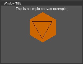
The described canvas is shown as follows:
checkbox#
Corresponds to an object of the WidgetCheckBox class.
![]()
Attributes:
- checked
Whether the checkbox is selected by default or not. The default is 0 (boolean).
Children:
<checkbox name="Test::checkbox0" export="1">
	<text>Checkbox 0</text>
</checkbox>
<checkbox name="Test::checkbox1" export="1" checked="1">
	<text>Checkbox 1</text>
</checkbox>
![]()
To create a radio button group, use the attach child:
<checkbox name="Test::radiobutton0" export="1" checked="1">
	<text>Variant 0</text>
</checkbox>
<checkbox name="Test::radiobutton1" export="1">
	<attach>Test::radiobutton0</attach>
	<text>Variant 1</text>
</checkbox>combobox#
Corresponds to an object of the WidgetComboBox class.

Attributes:
- texture
Path to a texture with mini-icons. This texture is a strip of N pixels in width and N×M pixels in height.
Children:
- text
Text of a list item. Multiple items are supported, the default item is the first one. In addition to the described attributes, the following attributes are accepted:- texture, which sets the ID of a mini-icon to be used for the item starting from zero.
- data, which sets the item data. The data can be used as a text identifier of the item (instead of using the number of the item).
<combobox name="Test::combobox" export="1">
	<text>item 0</text>
	<text>item 1</text>
	<text>item 2</text>
	<text>item 3</text>
</combobox>
To set a mini-icon for each item, use the texture attribute as follows:
<combobox name="Test::combobox" export="1" texture="combobox_icons.png">
	<text texture="0">item 0</text>
	<text texture="1">item 1</text>
	<text texture="2">item 2</text>
	<text texture="3">item 3</text>
</combobox>
The result is a list of items with icons:
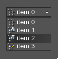
The combobox_icons.png image is a vertical strip of square (16×16 pixels) mini-icons that have a transparent background:
![]()
See the article on Skin Layout for more details.
editline#
Corresponds to an object of the WidgetEditLine class.

Attributes:
- editable
Whether to allow modifying the text or not. The default is 1 (boolean). - password
Whether the text should be displayed as dots. The default is 0 (boolean). - background
Whether the widget has a background or not. The default is 1 (boolean). - capacity
Maximum number of characters that can be entered (integer). - validator
Value validator, acceptable types are any, int, uint, float or ascii. - color
Text color. Changes the text color only if the text tag is not specified as a child. If the child tag is specified, this attribute won't affect the text color.
Children:
- text
The initial string.
<editline name="Test::editline" export="1" width="100" capacity="10">
	<text>EditLine</text>
</editline>
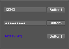
The following example shows possible ways of using the editline widget:
<hbox align="expand">
	<editline align="expand" validator="int"/>
	<button width="30">
		<text>Button1</text>
	</button>
</hbox>
<hbox align="expand">
	<editline align="expand" password="1"/>
	<button width="30">
		<text>Button2</text>
	</button>
</hbox>
<hbox align="expand">
	<editline align="expand" validator="any" background="0" color="#3300CC"/>
	<button width="30">
		<text>Button1</text>
	</button>
</hbox>
The first editline allows user to input the integer values only. The other symbols are not allowed to be typed. The text in the second editline is displayed as dots, because the password attribute is set to 1. The last editline has no background, and the text color is defined directly in the editline tag by using the color attribute.
edittext#
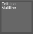
Corresponds to an object of the WidgetEditText class.
Attributes:
- editable
Whether to allow modifying the text or not. The default is 1 (boolean). - background
Whether the widget has a background or not. The default is 1 (boolean). - color
Text color. Changes the text color only if the text tag is not specified as a child. If the child tag is specified, this attribute won't affect the text color.
Children:
- text
The initial string.
<edittext name="Test::edittext" export="1" width="100" height="100">
	<text>EditLine
	Multiline</text>
</edittext>
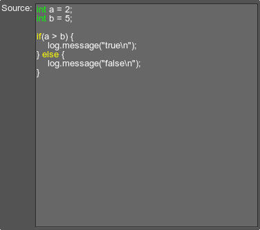
The edittext widget can be used, for example, to input some source code:
<hbox align="expand">
	<label align="left,top">Source:</label>
	<edittext name="Test::edittext" export="1" align="expand"/>
</hbox>
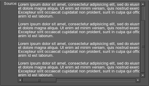
If the text scrolling is required, define the edittext widget inside the scrollbox container:
<scrollbox name="Test::scrollbox" align="expand">
	<edittext name="Test::edittext" export="1" align="expand"/>
</scrollbox>
hscroll#
Corresponds to an object of the WidgetScroll class.
![]()
Attributes:
- object
Width of the area to scroll (in pixels). The default is 100. - frame
Width of the visible frame (in pixels). The default is 10. - step
Number of pixels to scroll, when the user clicks one of the arrows. The default is 1. - value
Initial position of the scroller. Cannot exceed object-frame pixels.
<hscroll name="Test::hscroll" export="1" width="100"/>hslider#
Corresponds to an object of the WidgetSlider class.
![]()
Attributes:
- min
Minimum value (integer). - max
Maximum value (integer). - value
Initial value (integer). - min_expand
Minimum value, up to which the slider's lower limit can be dropped (integer). The lower limit of the slider can be changed only via the editline, to which it is attached with the expand of min_expand flag. - max_expand
Maximum value, up to which the slider's upper limit can be raised (integer). The upper limit of the slider can be changed only via the editline, to which it is attached with the expand of max_expand flag. - button_width
Width of the handle.
Children:
- attach
Widget name, which will display the current value of the slider.
<hslider name="Test::hslider" export="1" align="expand" min="500" max="3500" value="1000" width="100" button_width="30">
	<attach format=" %.1f" multiplier="1000">hslider_label</attach>
</hslider>
<label name="hslider_label" width="28"/>
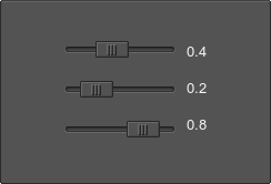
It is possible to combine several horizontal sliders by using one of the containers. For example:
<hbox space_x="10">
	<vbox space_y="20">
		<hslider name="Test::hslider_1" export="1" min="0" max="10" value="0" width="100" button_width="30">
			<attach format="%.1f" multiplier="10">hslider_option_1</attach>
		</hslider>
		<hslider name="Test::hslider_2" export="1" min="0" max="10" value="0" width="100" button_width="30">
			<attach format="%.1f" multiplier="10">hslider_option_2</attach>
		</hslider>
		<hslider name="Test::hslider_3" export="1" min="0" max="10" value="0" width="100" button_width="30">
			<attach format="%.1f" multiplier="10">hslider_option_3</attach>
		</hslider>
	</vbox>
	<vbox space_y="20">
		<label name="hslider_option_1"/>
		<label name="hslider_option_2"/>
		<label name="hslider_option_3"/>
	</vbox>
</hbox>
hspacer#
Corresponds to an object of the WidgetSpacer class.
![]()
Attributes:
- Width
Separator width.
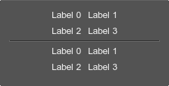
<hspacer width="50"/>The hspacer widget can be used to group the other widgets. For example:
<vbox>
	<gridbox name="Test::gridbox_1" space="10">
		<label><text>Label 0</text></label>
		<label><text>Label 1</text></label>
		<label><text>Label 2</text></label>
		<label><text>Label 3</text></label>
	</gridbox>
	<hspacer width="50"/>
	<gridbox name="Test::gridbox_2" space="10">
		<label><text>Label 0</text></label>
		<label><text>Label 1</text></label>
		<label><text>Label 2</text></label>
		<label><text>Label 3</text></label>
	</gridbox>
</vbox>
icon#
Corresponds to an object of the WidgetIcon class.
It is a square image, whose size is divisible by 2. For example, 16×16, 32×32, 64×64. Each icon has 4 states. For more details, see the article on Skin Layout.
![]()
Attributes:
- toggleable
Whether the widget is a toggle button or an ordinary one. The default is 0 (boolean). - toggled
Whether the icon serving as a toggle button is pressed by default or not. The default is 0 (boolean). - texture
Path to an icon image.
Children:
- text
The icon capture. The acceptable attributes are left, right, center.
<icon name="Test::icon_1" export="1" texture="icons/icon_1.png" toggleable="1"/>
<icon name="Test::icon_2" export="1" texture="icons/icon_2.png"/>
<icon name="Test::icon_3" export="1" texture="icons/icon_3.png" toggleable="1" toggled="1"/>
<icon name="Test::icon_4" export="1" texture="icons/icon_4.png" toggleable="1"/>
To add an image caption, use the text tag with the required set of attributes:
<icon name="Test::icon_1" export="1" texture="icon.png">
	<text voffset="25" size="15">Icon Caption</text>
</icon>
![]()
The following example demonstrates icons of different size and sets of attributes:
<gridbox name="Test::gridbox" space_y="10">
	<label>
		<text>16×16 icons:</text>
	</label>
	<hbox name="Test::hbox_1">
		<icon name="Test::icon_1" export="1" texture="icon_1.png" toggleable="1"/>
		<icon name="Test::icon_2" export="1" texture="icon_2.png"/>
	</hbox>
	<label>
		<text>32×32 icons:</text>
	</label>
	<hbox name="Test::hbox_2">
		<icon name="Test::icon_3" export="1" texture="icon_3.png"/>
		<icon name="Test::icon_4" export="1" texture="icon_4.png" toggleable="1" toggled="1"/>
	</hbox>
</gridbox>
The example shows the following:
![]()
Each icon represented by the image that includes 4 states of the icon. For example:
|
|
|
|
4 states of the 16×16 square icon
|
4 states of the 32×32 square icon
|
label#
Corresponds to an object of the WidgetLabel class.
![]()
The label widget can have any of the common attributes.
Children:
- text
Label text.NoticeThis tag can be omitted. In this case, all the text formatting attributes can be specified as attributes of the label.
<label>
	<text>Label</text>
</label>
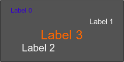
It is possible to change the width and height of the label, its alignment or position. The label text can be changed by using the text attributes. For example:
<label align="left">
	<text color="#3300CC">Label 0</text>
</label>
<label align="right">
	<text size="15">Label 1</text>
</label>
<label pos_x="30" pos_y="80" align="overlap">
	<text size="20">Label 2</text>
</label>
<label>
	<text size="25" color="#FF6600">Label 3</text>
</label>
If the text tag is omitted, text formatting attributes can be specified as follows:
<label font="fontb.ttf" size="10">Label</label>listbox#
Corresponds to an object of the WidgetListBox class.

Attributes:
- multi_selection
Whether to allow picking more than one item or not. CTRL and SHIFT modifiers are used for multiple selection. - texture
Path to a listbox texture of mini-icons. This texture is a bar of N pixels in width and N×M pixels in height.
Children:
- text
Text of a list item. Multiple items are supported. In addition to the described attributes, the following attributes are accepted:- texture
Sets the ID of a mini-icon to be used for the item starting from zero. - data
Sets the item data. The data can be used as a text identifier of the item (instead of using the number of the item).
- texture
<listbox multi_selection="1">
	<text>item 0</text>
	<text>item 1</text>
	<text>item 2</text>
	<text>item 3</text>
	<text>item 4</text>
	<text>item 5</text>
</listbox>
To add an icon for each list item, use the texture attribute as follows:
<listbox texture="menu_icons.png">
	<text texture="0">item 0</text>
	<text texture="1">item 1</text>
	<text texture="2">item 2</text>
	<text>item 3</text>
</listbox>
The result is:

The menu_icons.png image is a vertical strip of square mini-icons, each the size of 16×16 pixels, that has a transparent background:
![]()
See the article on Skin Layout for more details.
menubar#
Corresponds to an object of the WidgetMenuBar class.
![]()
Attributes:
- space
Overall spacing (pixels). - space_x
Horizontal spacing (pixels). - space_y
Vertical spacing (pixels).
Children:
- menu
A single menu. It describes a menu item and a dropdown menu that opens when clicking this menu item. Acceptable attributes:- enabled (boolean)
Specifies whether the item is enabled (i.e. you can interact with this item). By default, the item is enabled. - space
Sets a space between the current item and the next item located to the right.
Children:
- text
Title of a menu item.NoticeIn addition to the described attributes, the following attributes are accepted:If you set a color, font size or any other text attribute for the item, this attribute value will be applied for all menu items on the current level.NoticeThe attributes below are applied for each item separately.- data
Sets the item data. The data can be used as a text identifier of the item (instead of using the number of the item).
- data
- menubox
Dropdown menu that opens when clicking the menu item.
- enabled (boolean)
<hbox background="1" space="5">
	<menubar align="expand">
		<menu>
			<text>File</text>
			<menubox name="Test::file_mb">
				…
			</menubox>
		</menu>
		<menu>
			<text>Edit</text>
			<menubox name="Test::edit_mb">
				…
			</menubox>
		</menu>
		<menu>
			<text>Help</text>
			<menubox name="Test::help_mb">
				…
			</menubox>
		</menu>
	</menubar>
</hbox>
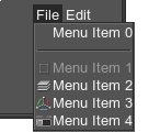
All of the common attributes can be be used for the menubar. For example:
<menubar name="Test::menubar" align="right">
	<menu>
		<text>File</text>
		<menubox name="Test::file" texture="menubox_icons.png" align="left">
			<text separator="1">Menu Item 0</text>
			<text enabled="0" texture="0">Menu Item 1</text>
			<text texture="1">Menu Item 2</text>
			<text texture="2">Menu Item 3</text>
			<text texture="3">Menu Item 4</text>
		</menubox>
	</menu>
	<menu enabled="0">
		<text>Edit</text>
		<menubox name="Test::edit">
			<text>Menu Item 0</text>
		</menubox>
	</menu>
</menubar>
The example shows the following:
menubox#
Corresponds to an object of the WidgetMenuBox class.

Attributes:
- texture
Path to a menubox texture of mini-icons. This texture is a strip of N pixels in width and N×M pixels in height. - space
Overall spacing (pixels). - space_x
Horizontal spacing (pixels). - space_y
Vertical spacing (pixels).
Children:
- text
Text of a menu item. Multiple items are supported.NoticeIn addition to the described attributes, the following attributes are accepted:If you set a color, font size or any other text attribute for the item, this attribute value will be applied for all menu items on the current level.NoticeThe attributes below are applied for each item separately.- enabled (boolean)
Specifies whether the item is enabled (i.e. you can interact with this item). By default, the item is enabled. - selectable
Specifies whether the item can be selected (i.e. the item is highlighted when you point to it). By default, the item is selectable. - separator (boolean)
Specifies whether the item is followed by a separator. - space
Sets a space between the current menu item and the next item (pixels). - texture
Sets the ID of a mini-icon to be used for the item starting from zero. - data
Sets the item data. The data can be used as a text identifier of the item (instead of using the number of the item).
- enabled (boolean)
- menu
A single menu. It describes a menu item, its tooltip and a cascading menu that opens when clicking this menu item. Multiple menus are supported.- enabled (boolean)
Specifies whether the item is enabled (i.e. you can interact with this item). By default, the item is enabled. - selectable
Specifies whether the item can be selected (i.e. the item is highlighted when you point to it). By default, the item is selectable. - separator (boolean)
Specifies whether the item is followed by a separator. - space
Sets a space between the current menu item and the next item (pixels). - texture
Sets the ID of a mini-icon to be used for the item starting from zero. - data
Sets the item data. The data can be used as a text identifier of the item (instead of using the number of the item).
Children:
- text
Menu title.NoticeIn addition to the described attributes, the following attributes are accepted:If you set a color, font size or any other text attribute for the item, this attribute value will be applied for all menu items on the current level.NoticeThe attributes below are applied for each item separately.- data
Sets the item data. The data can be used as a text identifier of the item (instead of using the number of the item).
- data
- menubox
Cascading menu that opens when clicking the menu item. - tooltip
Tooltip for the menu item.
- enabled (boolean)
- widget
A single widget or a container that is used as a menu item. The attributes used for the text tag are also appropriate forwidget.
NoticeIf you set a color, font size or any other text attribute for the item, this attribute value will be applied for all menu items on the current level.In addition, the following attributes are acceptable:
NoticeThe attributes below are applied for each item separately.- enabled (boolean)
Specifies whether the item can be selected. By default, the item is enabled. - selectable (boolean)
Specifies whether the item can be selected (i.e. the item is highlighted when you point to it). By default, the item is selectable. - separator (boolean)
Specifies whether the item is followed by a separator. - space
Sets a space between the current menu item and the next item (pixels). - texture
Sets the ID of a mini-icon to be used for the item starting from zero. - data
Sets the item data. The data can be used as a text identifier of the item (instead of using the number of the item).
- enabled (boolean)
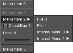
<menubox space="8">
<text separator="1">Menu Item 0</text>
<text enabled="0">Menu Item 1</text>
<menu>
<text data="1">Menu Item 2 ►</text>
<menubox width="64" space="8">
<text>File 0</text>
<text>File 1</text>
<menu>
<text>Internal Menu 0 ►</text>
<tooltip>Internal Menu 0 tooltip</tooltip>
<menubox width="64" space="8">
<text>File 2</text>
<text>File 3</text>
</menubox>
</menu>
<menu>
<text>Internal Menu 1 ►</text>
<menubox width="64" space="8">
<text>File 4</text>
<text>File 5</text>
</menubox>
</menu>
</menubox>
</menu>
<widget>
<checkbox align="expand">
<text>CheckBox 1</text>
</checkbox>
</widget>
<widget separator="1" selectable="0">
<vbox align="expand">
<label name="MenuLabel" align="expand">
<text>Label 0</text>
</label>
<vbox space="4"/>
<hslider align="expand">
<attach format="Label %d">MenuLabel</attach>
</hslider>
</vbox>
</widget>
<text>Menu Item 3</text>
</menubox>The example produces the following:
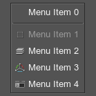
To add an icon for each item, use the texture attribute as follows:
<menubox space="8" texture="menu_icons.png">
	<text separator="1">Menu Item 0</text>
	<text enabled="0" texture="0">Menu Item 1</text>
	<text texture="1">Menu Item 2</text>
	<text texture="2">Menu Item 3</text>
	<text texture="3">Menu Item 4</text>
</menubox>
The result is the following:
The menu_icons.png image is a vertical strip of square mini-icons, each the size of 16×16 pixels, that has a transparent background:
![]()
See the article on Skin Layout for more details.
spinbox#
Corresponds to an object of the WidgetSpinBox class.

Attributes:
- min
Minimum value (integer). - max
Maximum value (integer). - min_expand
Minimum value, up to which the lower limit of the spinbox can be dropped (integer). The lower limit of the spinbox can be changed only via the editline, to which it is attached with the expand of min_expand flag (integer). - max_expand
Maximum value, up to which the upper limit of the spinbox can be raised (integer). The upper limit of the spinbox can be changed only via the editline, to which it is attached with the expand of max_expand flag (integer). - value
Initial value (integer).
Children:
- attach
Widget name, which will display the current value of the spinbox.
<hbox>
	<editline name="editline">
		<text>11</text>
	</editline>
	<spinbox max="100" min="10" value="11" align="overlap">
		<attach>editline</attach>
	</spinbox>
</hbox>
All of the common attributes are acceptable. For example, you can enable the spinbox:
<spinbox max="100" min="10" value="11" align="overlap" enabled="0">
	<attach>editline</attach>
</spinbox>sprite#
Corresponds to an object of the WidgetSprite class.
Sprite is an image composed of several layers that can be assigned textures, scaled, translated and colored.
![]()
Attributes:
- color
Modulation color of the first layer. - texture
Path to a texture of the first layer. - scale
Scale factor for the first layer. - scale_x
Scale factor for the first layer (by x). - scale_y
Scale factor for the first layer (by y). - translate
Offset for the first layer. - translate_x
Offset for the first layer (by x). - translate_y
Offset for the first layer (by y). - texcoord_x
The X coordinate of the upper left corner of the texture for the first (bottom) layer of the sprite. - texcoord_y
The Y coordinate of the upper left corner of the texture for the first (bottom) layer of the sprite. - texcoord_z
The X coordinate of the lower right corner of the texture for the first (bottom) layer of the sprite. - texcoord_w
The Y coordinate of the lower right corner of the texture for the first (bottom) layer of the sprite.
Children:
- layer
A 2D layer, additional to the default (first) layer. Multiple layers are supported. Acceptable attributes:- color
Modulation color. - texture
Path to the texture of the layer. - scale
Overall scale factor (float). - scale_x
Horizontal scale factor (float). - scale_y
Vertical scale factor (float). - translate
Overall layer offset (float). - translate_x
Horizontal layer offset (float). - translate_y
Vertical layer offset float).
- color
<sprite name="Test::sprite" export="1" color="#ff0000" texture="sprites/layer0.png" scale="0.5">
	<layer color="#00ff00" texture="sprites/layer1.png" scale_x="0.8"/>
</sprite>treebox#
Corresponds to an object of the WidgetTreeBox class.
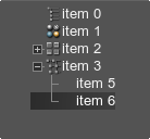
Attributes:
- editable
Whether to allow modifying the hierarchy of items or not. The hierarchy can be modified by dragging items with ALT pressed. - multi_selection
Whether to allow picking more than one item or not. CTRL and SHIFT modifiers are used for multiple selection. - texture
Path to a treebox texture of mini-icons. This texture is a bar of N pixels in width and N×M pixels in height.
Children:
- text
Text of a list item. Multiple items are supported. In addition to the described attributes, the following attributes are accepted:- texture
Sets the ID of a mini-icon to be used for the item starting from zero. - parent
Specifies a parent item for the current one. The text of the parent item must be specified. - data
Sets the item data. The data can be used as a text identifier of the item (instead of using the number of the item).
- texture
<treebox name="Test::treebox" editable="1" multi_selection="1" texture="menu_icons.png">
	<text texture="0">item 0</text>
	<text texture="1">item 1</text>
	<text texture="2">item 2</text>
	<text texture="3">item 3</text>
	<text parent="item 2">item 4</text>
	<text parent="item 3">item 5</text>
	<text parent="item 3">item 6</text>
</treebox>
The menu_icons.png image is a vertical strip of square mini-icons, each the size of 16×16 pixels, that has a transparent background:
![]()
See the article on Skin Layout for more details.
vscroll#
Corresponds to an object of the WidgetScroll class.

Attributes:
- object
Height of the area to scroll (in pixels). The default is 100. - frame
Height of the visible frame (in pixels). The default is 10. - step
Number of pixels to scroll, when the user clicks one of the arrows. The default is 1. - value
Initial position of the scroller. Cannot exceed object-frame pixels.
<vscroll name="Test::vscroll" export="1" height="100"/>vslider#
Corresponds to an object of the WidgetSlider class.
Attributes:
- min
Minimum value (integer). - max
Maximum value (integer). - value
Initial value (integer). - min_expand
Minimum value, up to which the slider's lower limit can be dropped (integer). The lower limit of the slider can be changed only via the editline, to which it is attached with the expand of min_expand flag. - max_expand
Maximum value, up to which the slider's upper limit can be raised (integer). The upper limit of the slider can be changed only via the editline, to which it is attached with the expand of max_expand flag. - button_height
Height of the handle.
Children:
- attach
Widget name, which will display the current value.
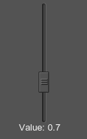
<vslider name="Test::vslider" export="1" align="expand" min="0" max="1000" value="500" height="100" button_height="30">
	<attach format="Value: %.1f" multiplier="1000">vslider_label</attach>
</vslider>
<label name="vslider_label" width="70"/>
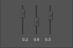
The vslider widget can be used, for example, to select the option value:
<hbox space_x="30">
	<vslider name="Test::vslider_1" export="1" min="0" max="10" value="0" height="100" button_height="30">
		<attach format="%.1f" multiplier="10">vslider_option_1</attach>
	</vslider>
	<vslider name="Test::vslider_2" export="1" min="0" max="10" value="0" height="100" button_height="30">
		<attach format="%.1f" multiplier="10">vslider_option_2</attach>
	</vslider>
	<vslider name="Test::vslider_3" export="1" min="0" max="10" value="0" height="100" button_height="30">
		<attach format="%.1f" multiplier="10">vslider_option_3</attach>
	</vslider>
</hbox>
<hbox space_x="20">
	<label name="vslider_option_1"/>
	<label name="vslider_option_2"/>
	<label name="vslider_option_3"/>
</hbox>
The result is a set of vertical sliders representing 3 options:
vspacer#
Corresponds to an object of the WidgetSpacer class.

Attributes:
- height
Separator height.
<vspacer height="50"/>For example, you can visually group several icons by using the vspacer widget:
<hbox name="Test::hbox">
	<icon name="Test::icon_1" export="1" texture="icon.png"></icon>
	<icon name="Test::icon_2" export="1" texture="icon_3.png"></icon>
	<vspacer height="30"/>
	<icon name="Test::icon_3" export="1" texture="icon_4.png" toggleable="1"></icon>
</hbox>
The example shows the following:

The information on this page is valid for UNIGINE 2.19.1 SDK.