Containers
Containers are used to organize and group single widgets.
Common attributes
Besides the common attributes, there is a set of container-specific attributes, which any container can have.
-
space
Overall spacing (pixels). -
space_x
Horizontal spacing (pixels). -
space_y
Vertical spacing (pixels). -
padding
Top, bottom, left and right padding (pixels). The padding serves to set the distance between the border of the widget and its content.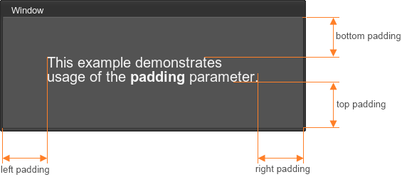
The code example is:
Source code(XML)<window name="Test::window" width="250" height="250" export="1" padding="50"> <text>Window</text> <font size="20"> <label> <text rich="1">This example demonstrates<br/> usage of the <font face="core/gui/fontb.ttf">padding</font> parameter.<br/> </text> </label> </font> </window> -
padding_l
Left padding (pixels). -
padding_r
Right padding (pixels). -
padding_t
Top padding (pixels). -
padding_b
Bottom padding (pixels). -
padding_lr
Left and right padding (pixels).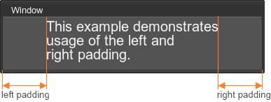
The code example is:
Source code(XML)<window name="Test::window" width="250" height="250" export="1" padding_lr="50"> <text>Window</text> <font size="20"> <label> <text rich="1">This example demonstrates<br/> usage of the left and<br/> right padding.<br/> </text> </label> </font> </window> -
padding_tb
Top and bottom padding (pixels).Source code(XML)<window name="Test::window" width="250" height="250" export="1" padding_tb="50"> ... </window>This attribute is used the same way as padding_lr, except that the top and bottom padding is specified in this case.
vbox
Corresponds to an object of the WidgetVBox class.

Attributes:
-
background
Whether the container has a background or not. The default is 0 (boolean, no background). -
stencil
Whether the container cuts off its children along its bounds. Everything that lies outside of them, is not rendered. Only works for children with align="overlap" flag set (otherwise, they will expand the box widget and no cutting will be done). The default is 0 (boolean). -
color
Color of container children.
<vbox name="Test::vbox" export="0" space="8">
	<label><text>Label 0</text></label>
	<label><text>Label 1</text></label>
	<label><text>Label 2</text></label>
</vbox>
The example of the stencil attribute usage:

<vbox name="Test::vbox" export="1" stencil="1" width="60" height="10">
	<label align="overlap"><text>stencil test</text></label>
</vbox>
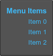
For example, to describe elements of a right-aligned vertical menu, use the following:
<vbox name="Test::vbox" export="1" space_y="8" width="30" height="80" color="#3DBEFF">
	<label align="right"><text size="15" rich="1"><font face="fontb.ttf">Menu Items</font></text></label>
	<label align="right"><text>Item 0</text></label>
	<label align="right"><text>Item 1</text></label>
	<label align="right"><text>Item 2</text></label>
</vbox>
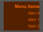
It is also possible to set the container background and change its color. For example:
<vbox name="Test::vbox" export="1" space_y="8" width="30" height="80" color="#FF6600" background="1">
	...
</vbox>
hbox
Corresponds to an object of the WidgetHBox class.
![]()
Attributes:
-
background
Whether the container has a background or not. The default is 0 (boolean). -
stencil
Whether the container cuts off its children along its bounds. Everything that lies outside of them, is not rendered. Only works for children with align="overlap" flag set (otherwise, they will expand the box widget and no cutting will be done). The default is 0 (boolean). -
color
Color of container children.
<hbox name="Test::hbox" export="0" space="8">
	<label><text>Label 0</text></label>
	<label><text>Label 1</text></label>
	<label><text>Label 2</text></label>
</hbox>
The stencil attribute usage is the same as for vbox:

<hbox name="Test::hbox" export="1" stencil="1" width="70" height="12">
	<label align="overlap"><text size="17">stencil test</text></label>
</hbox>
hbox can be used, for example, to create a horizontal menu:
<label align="left"><text size="15" rich="1"><font face="fontb.ttf">Menu Items</font></text></label>
<hbox name="Test::hbox" export="1" space_x="8" width="140" height="20" color="#3DBEFF" padding_t="5">
	<label align="left"><text>Item 0</text></label>
	<label align="left"><text>Item 1</text></label>
	<label align="left"><text>Item 2</text></label>
</hbox>
In this example, a space between items is set by using the space_x attribute. The font of the menu title is set by using the font tag with the face attribute.

The container background can be set the same way as for the vbox container:
<label align="left"><text size="15" rich="1"><font face="fontb.ttf">Menu Items</font></text></label>
<hbox name="Test::hbox" space_x="8" width="140" height="20" color="#FF6600" padding_t="5" background="1">
	..
</hbox>

vpaned
Corresponds to an object of the WidgetVPaned class.
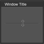
Attributes:
-
value
Value in range [-32767; 32767]. -32767 means that during resize the upper child will remain fixed. 32767 means that during resize the lower child will remain fixed. 0 means that both children will be resized equally. Other values specify proportions, in which the children are resized. The default is 0. -
fixed
Whether to set the fixed size for the first or the second child. Acceptable values:- 0 to resize both children of the vpaned container while window resizing.
- 1 to set fixed size for the first child.
- 2 to set fixed size for the second child.
<vpaned name="Test::vpaned" align="expand" value="-32767">
	<hbox>…</hbox>
	<hbox>…</hbox>
</vpaned>
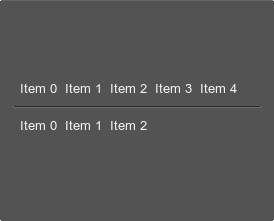
You can also use the width attribute to set container width. The other common attributes are also available.
For example:
<vpaned name="Test::vpaned" value="-32767" width="250" align="center">
	<hbox name="Test::hbox_1" export="0" space="8">
		<label align="left"><text>Item 0</text></label>
		<label align="left"><text>Item 1</text></label>
		<label align="left"><text>Item 2</text></label>
		<label align="left"><text>Item 3</text></label>
		<label align="left"><text>Item 4</text></label>
	</hbox>
	<hbox name="Test::hbox_2" export="0" space="8">
		<label align="left"><text>Item 0</text></label>
		<label align="left"><text>Item 1</text></label>
		<label align="left"><text>Item 2</text></label>
	</hbox>
</vpaned>
hpaned
Corresponds to an object of the WidgetHPaned class.
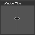
Attributes:
-
value
Value in range [-32767; 32767]. -32767 means that during resize the left child will remain fixed. 32767 means that during resize the right child will remain fixed. 0 means that both children will be resized equally. Other values specify proportions, in which the children are resized. The default is 0. -
fixed
Whether to set the fixed size for the first or the second child. Acceptable values:- 0 to resize both children of the hpaned container while window resizing.
- 1 to set fixed size for the first child.
- 2 to set fixed size for the second child.
<hpaned name="Test::hpaned" align="expand" value="-32767">
	<vbox>…</vbox>
	<vbox>…</vbox>
</hpaned>
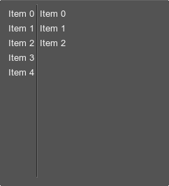
You can use the height attribute to set container height. The other common attributes are also available.
For example:
<hpaned name="Test::hpaned" value="-32767" height="250" align="left" pos_x="50">
	<vbox name="Test::vbox_1" export="0" space_y="8">
		<label align="left"><text>Item 0</text></label>
		<label align="left"><text>Item 1</text></label>
		<label align="left"><text>Item 2</text></label>
		<label align="left"><text>Item 3</text></label>
		<label align="left"><text>Item 4</text></label>
	</vbox>
	<vbox name="Test::vbox_2" export="0" space_y="8">
		<label align="left"><text>Item 0</text></label>
		<label align="left"><text>Item 1</text></label>
		<label align="left"><text>Item 2</text></label>
	</vbox>
</hpaned>
gridbox
Corresponds to an object of the WidgetGridBox class.

Attributes:
-
background
Whether the container has a background or not. The default is 1 (boolean). -
columns
Number of columns (integer). -
ratio
Width-to-height ratio of columns (vector with integer values). -
stencil
Whether the container cuts off its children along its bounds. Everything that lies outside of them, is not rendered. Only works for children with align="overlap" flag set (otherwise, they will expand the box widget and no cutting will be done). The default is 0 (boolean). -
color
Color of container children.
<gridbox name="Test::gridbox" export="0" columns="2" space="8">
	<label><text>Label0</text></label>
	<label><text>Label1</text></label>
	<label><text>Label2</text></label>
	<label><text>Label3</text></label>
</gridbox>
The gridbox container is used to display data in multiple columns and rows. For example, you can create a table that contains a set of different settings:
<gridbox name="Test::settings" export="1" columns="2" align="right" space_y="10" ratio="2,4">
	<label>
		<text>Label1:</text>
	</label>
	<editline name="Test::edit_1" export="1" width="100">
		<text>EditLine1</text>
	</editline>
	<label>
		<text>Label2:</text>
	</label>
	<editline name="Test::edit_2"  export="1" width="100">
		<text>EditLine2</text>
	</editline>
</gridbox>

If the gridbox background is required, set the background attribute to 1 and define its color as follows:
<gridbox name="Test::gridbox" export="0" columns="2" space="8" background="1" color="#FF6600">
	...
</gridbox>

groupbox
Corresponds to an object of the WidgetGroupBox class.

Attributes:
-
background
Whether the container has a background or not. The default is 1 (boolean). -
stencil
Whether the container cuts off its children along its bounds. Everything that lies outside of them, is not rendered. Only works for children with align="overlap" flag set (otherwise, they will expand the box widget and no cutting will be done). The default is 0 (boolean). -
color
Color of container children. A color is set for all of the children except the specific child text.
Specific children:
-
text
Optional title string.
<groupbox name="Test::groupbox" export="0" space="8" align="center">
	<text>Group</text>
	<label><text>Label0</text></label>
	<label><text>Label1</text></label>
</groupbox>
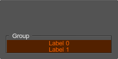
For example, to create a groupbox with colored content and the background, you can use the following:
<groupbox name="Test::groupbox" export="0" background="1" align="bottom" color="#FF6600" width="50" height="35">
	<text>Group</text>
	<label><text>Label 0</text></label>
	<label><text>Label 1</text></label>
</groupbox>
tabbox
Corresponds to an object of the WidgetTabBox class.

Attributes:
-
texture
Path to the tabbox texture of mini-icons. This texture is a bar of N pixels in width and N×M pixels in height.
Specific children:
-
tab
A tab. Multiple tabs are supported. Each tab can also have a special child:
<tabbox name="Test::tabbox" export="1" space="20" align="expand">
	<tab>
		<text>Tab 0</text>
		<label><text>TabBox content</text></label>
	</tab>
	<tab>
		<text>Tab 1</text>
	</tab>
	<tab>
		<text>Tab 2</text>
	</tab>
	<tab>
		<text>Tab 3</text>
	</tab>
</tabbox>
To create tabs with icons, you can write the following:
<tabbox name="Test::tabbox_icons" export="1" space="20" align="expand" texture="menu_icons.png">
	<tab>
		<text texture="0">Tab 0</text>
		<label><text>TabBox content</text></label>
	</tab>
	<tab>
		<text texture="1">Tab 1</text>
	</tab>
	<tab>
		<text texture="2">Tab 2</text>
	</tab>
</tabbox>
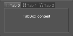
The menu_icons.png image is a vertical strip of square (16×16 pixels) mini-icons that have a transparent background:
![]()
See the article on Skin Layout for more details.
scrollbox
Corresponds to an object of the WidgetScrollBox class.
Attributes:
-
border
Whether to enable a border line or not (boolean). -
henabled
Whether to enable horizontal scrolling or not (boolean). -
venabled
Whether to enable vertical scrolling or not (boolean). -
hhidden
Whether to hide, disable or always render a horizontal scroll bar.- 0 to always render a horizontal scroll bar.
- 1 to automatically hide a horizontal scroll bar, if the container area is big enough to show all elements. If not all elements can be shown at once, the scroll bar is rendered.
- 2 to always hide a horizontal scroll bar. Scroll bar bounds, though a bar itself is not rendered, are still taken into account when the widget bounds are calculated.
- 3 to always hide a horizontal scroll bar and not to add its size when calculating widget bounds.
-
vhidden
Whether to hide, disable or always render a vertical scroll bar.- 0 to always render a vertical scroll bar.
- 1 to automatically hide a vertical scroll bar, if the container area is big enough to show all elements. If not all elements can be shown at once, the scroll bar is rendered.
- 2 to always hide a vertical scroll bar. Scroll bar bounds, though a bar itself is not rendered, are still taken into account when the widget bounds are calculated.
- 3 to always hide a vertical scroll bar and not to add its size when calculating widget bounds.
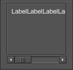
<scrollbox name="Test::scrollbox" export="0" space="8" align="center" width="100" height="100" border="1" henabled="1">
	<label><text>LabelLabelLabelLabelLabelLabelLabelLabelLabel</text></label>
</scrollbox>
For example, to create a scroll box with a vertical and horizontal scroll bars, you can write the following:
<scrollbox name="Test::scrollbox" export="0" space="8" border="1" width="60">
	<align align="left">
		<vbox name="Test::vbox" export="0" space="8">
			<label><text>Label 0</text></label>
			<label><text size="15">Label 1</text></label>
			<label><text size="20">Label 2</text></label>
			<label><text size="25">Label 3</text></label>
		</vbox>
	</align>
</scrollbox>
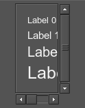
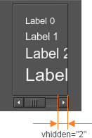
If you set the vhidden attribute to 2, the vertical scroll bar won't be rendered, but will be taken into account while scroll box bounds calculation:
<scrollbox name="Test::scrollbox" export="0" space="8" border="1" width="60" vhidden="2">
	...
</scrollbox>
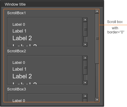
It is also possible to enable or disable the border line of the scroll box. It is useful, for example, if you want to add several scroll boxes with the borders into another scroll box, which has no borders:
<scrollbox name="Test::scrollbox" export="0" space="8" border="0" width="200" height="300" align="expand">
	<align align="left">
		<label><text>ScrollBox1</text></label>
		<scrollbox name="Test::scrollbox_1" export="0" space="8" border="1" width="250" height="80">
			<vbox name="Test::vbox_1" export="0" space="8">
				<label><text>Label 0</text></label>
				<label><text size="15">Label 1</text></label>
				<label><text size="20">Label 2</text></label>
				<label><text size="25">Label 3</text></label>
			</vbox>
		</scrollbox>
		<label><text>ScrollBox2</text></label>
		<scrollbox name="Test::scrollbox_2" export="0" space="8" border="1" width="250" height="80">
			<vbox name="Test::vbox_2" export="0" space="8">
				<label><text>Label 0</text></label>
				<label><text size="15">Label 1</text></label>
				<label><text size="20">Label 2</text></label>
				<label><text size="25">Label 3</text></label>
			</vbox>
		</scrollbox>
		<label><text>ScrollBox3</text></label>
		<scrollbox name="Test::scrollbox_3" export="0" space="8" border="1" width="250" height="80">
			<vbox name="Test::vbox_3" export="0" space="8">
				<label><text>Label 0</text></label>
				<label><text size="15">Label 1</text></label>
			</vbox>
		<scrollbox>
	</align>
</scrollbox>
window
Corresponds to an object of the WidgetWindow class.

Attributes:
-
moveable
Whether the window is movable or not. The default is 1 (boolean). -
sizeable
Whether the window is resizable or not. The default is 0 (boolean). -
titleable
Whether the window is minimized when double-clicking on it or not. The default is 0 (boolean). -
blendable
Whether the window is shaded when it is not in focus. The default is 0 (boolean). -
floatable
Whether window minimization is animated or not. The default is 0 (boolean). -
snap_distance
Maximum distance to snap the widget to borders of the application window. The default is 0 (pixels). -
color
Window color.For example:
Source code(XML)The result is:<window name="Test::window" export="1" width="200" height="200" color="#7FC9FF"> <text align="right">Window title</text> <label><text size="15">Example of the colored window</text></label> </window>
-
max_width
Maximum window width. -
max_height
Maximum window height.
Specific children:
-
text
Window title. In addition to the described attributes, the following attributes are accepted:- align with values center, left, right.
<window name="Test::window" export="1" snap_distance="16" width="100" height="100">
	<text align="right">Window title</text>
</window>
For example, if you set the maximum window width and height, you cannot make the window higher or wider than this maximum values.
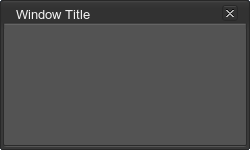
<window name="Test::window" width="250" height="150" export="1" titleable="1" sizable="1" max_width="300" max_height="400">
	<text>Window Title</text>
</window>
To add a window close button, place the icon widget on the title bar and define the corresponding callback as follows:
<window name=Test::window" export="1" width="250" height="150" sizeable="1" enabled="1">
	<text align="left">Window Title</text>
	<icon align="overlap,top,right" pos_x="4" pos_y="-24" texture="core/gui/dialog_close.png">
		<callback type="clicked">Window::close_window</callback>
	</icon>
</window>
dialog
Corresponds to an object of the WidgetDialog class.

Attributes:
-
moveable
Whether the dialog is movable or not. The default is 1 (boolean). -
sizeable
Whether the dialog is resizable or not. The default is 0 (boolean). -
titleable
Whether the dialog is minimized when double-clicking on it or not. The default is 0 (boolean). -
blendable
Whether the dialog becomes transparent while minimized or not. The default is 0 (boolean). -
floatable
Whether dialog minimization is animated or not. The default is 0 (boolean). -
snap_distance
Maximum distance to snap to borders. The default is 0 (pixels).
Specific children:
-
text
Dialog title. In addition to the described attributes, the following attributes are accepted:- align with values center, left, right.
<dialog width="100" height="100">
	<text align="right">Dialog title</text>
</dialog>
For example, to create a dialog window, which is minimized when double-clicking on it, try the following:
<dialog name="Test::dialog" export="1" width="100" height="100" titleable="1">
	<text align="right" color="#FFD800">Dialog title</text>
</dialog>


To add content to the dialog window, simply define any widget inside the dialog tag. For example:
<dialog name="Test::dialog" export="1" width="100" height="100" titleable="1">
	<text align="right">Dialog title</text>
	<label align="left"><text size="15">The text example.</text></label>
</dialog>
